Multi Column Callout
Overview
Multi Column Callout layout take advantage of Obsidian Callout - leveraging it as parent 'div' to house the sub callout (including Dataview results block). You can nest as many sub-callouts within it
The sub-callout will expand if [!multi-column] callout has extra space or overflow to next row if it doesn't. Some degree of control is available - see Additional Controls below

How to Use / Basic Syntax
Here's a quick steps to create the Multi Column Callout. It's best to start with sub-callouts first to avoid getting confused on how to nest them.
- Create the sub-callouts you want to include. In the example below they are
[!note],[!warning]and[!summary] - Wrap / encapsulate those sub-callouts with
[!multi-column]callout
Here's an example markdown
> [!multi-column]
>
>> [!note]+ Work
>> your notes or lists here. using markdown formatting
>
>> [!warning]+ Personal
>> your notes or lists here. using markdown formatting
>
>> [!summary]+ Charity
>> your notes or lists here. using markdown formatting
Note that when you insert callout within callout, the line separating the callouts should only use single angle bracket (">"). Example below
>> [!callout]
>> callout content (note that below this line, only one angle bracket)
>
>> [!callout]
>> callout content
What Counts as Column? By default, another callout (aka sub-callout) within [!multi-column] is how you create a "column". But this snippets do provide a few alternatives i.e. (dataview blocks, paragraph, list block, etc.). List block need to have <br/> tag in between lists override "markdown loose list" rendering, or at least changing the bullet symbols. See Examples of sub elements for MC Callout for more details.
With the release of 0.9.7, you can now use nested Multi Column Callout. See Using MC Callout within MC Callout for more details.
> [!<callout-type>]e.g.> [!Summary]> [!<callout-type>|<callout-metadata>]e.g.> [!Summary|wide-2]
Additional Controls
- Callout Width Control #mcl/list-card
- You can control sub-callout width by specifying the custom width option in the callout-metadata element (do NOT apply to
[!multi-column]callout itself. So far, there's only a discrete options per below
- You can control sub-callout width by specifying the custom width option in the callout-metadata element (do NOT apply to
- No Wrap Option
- Use modifier
no-wrapto create multi column callout on a single row multi column callout and automatically enable horizontal scrolling. The scrollbar will appear when the sub-callouts exceed the width of the[!multi-column]
- Use modifier
- Icons options
- Use modifier
icons(and optionallycol2/col3/col4) to create sub-callout with fixed width. This may be useful if you want to create dashboard with icon that you want to stay clustered together rather than spread to fill in the space.
- Use modifier
Available Global Settings via Style Settings
If you have Style Settings plugin installed, you may control the following aspects (go to Style Settings > Modular CSS Layout - Multi Column > Multi Column Callout)
- Hide / Show SNW Indicator for images in MC Callout
- Adjust minimum width for general sub-callout and No-Wrap sub-callout
- Adjust gap between sub-callout and margin between sub-callout
Examples
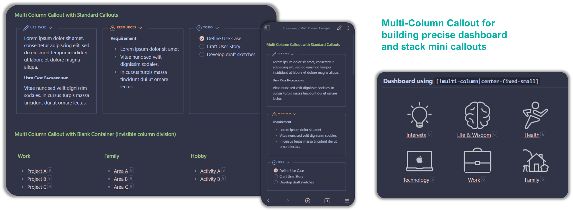
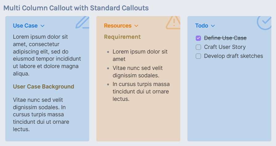
Standard Multi-Column Callout
> [!multi-column]
>
>> [!note]+ Use Case
>> Lorem ipsum dolor sit amet, consectetur adipiscing elit, sed do eiusmod tempor incididunt ut labore et dolore magna aliqua.
>>
>> ##### User Case Background
>> Vitae nunc sed velit dignissim sodales. In cursus turpis massa tincidunt dui ut ornare lectus.
>
>> [!warning]+ Resources
>> #### Requirement
>> - Lorem ipsum dolor sit amet
>> - Vitae nunc sed velit dignissim sodales.
>> - In cursus turpis massa tincidunt dui ut ornare lectus.
>
>> [!todo]+
>> - [x] Define Use Case
>> - [ ] Craft User Story
>> - [ ] Develop draft sketches
< Multi Column Home | Multi Column Home | Next: Float Callout >
